The Catalog Row Test: Do Your Jewelry Photos Look Like One Brand?
Why catalog consistency matters for jewelry brands, and how AI retouching keeps lighting, background, and style aligned across hundreds of product images.
Read More
Why consistency makes or breaks jewelry catalogs
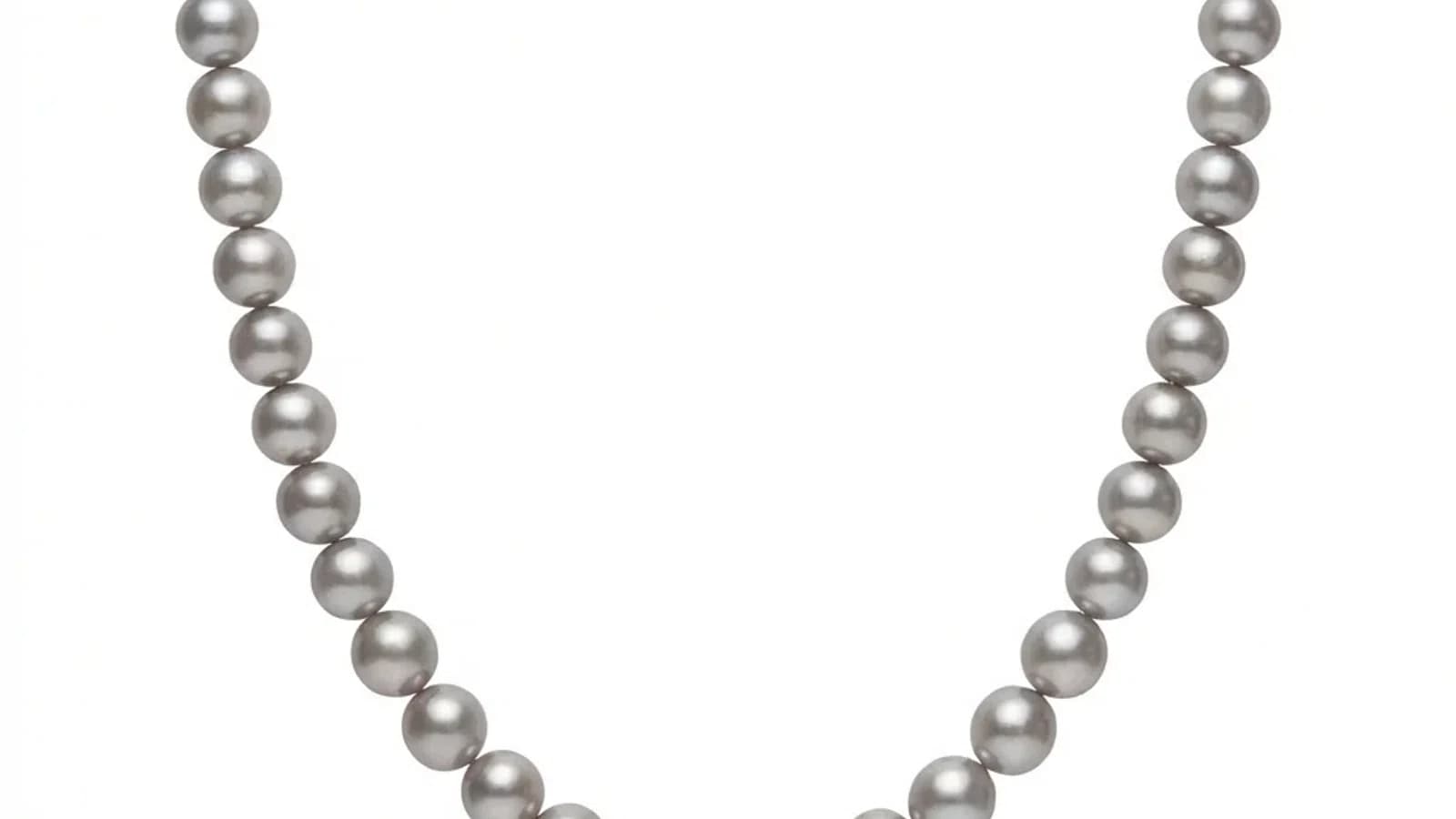
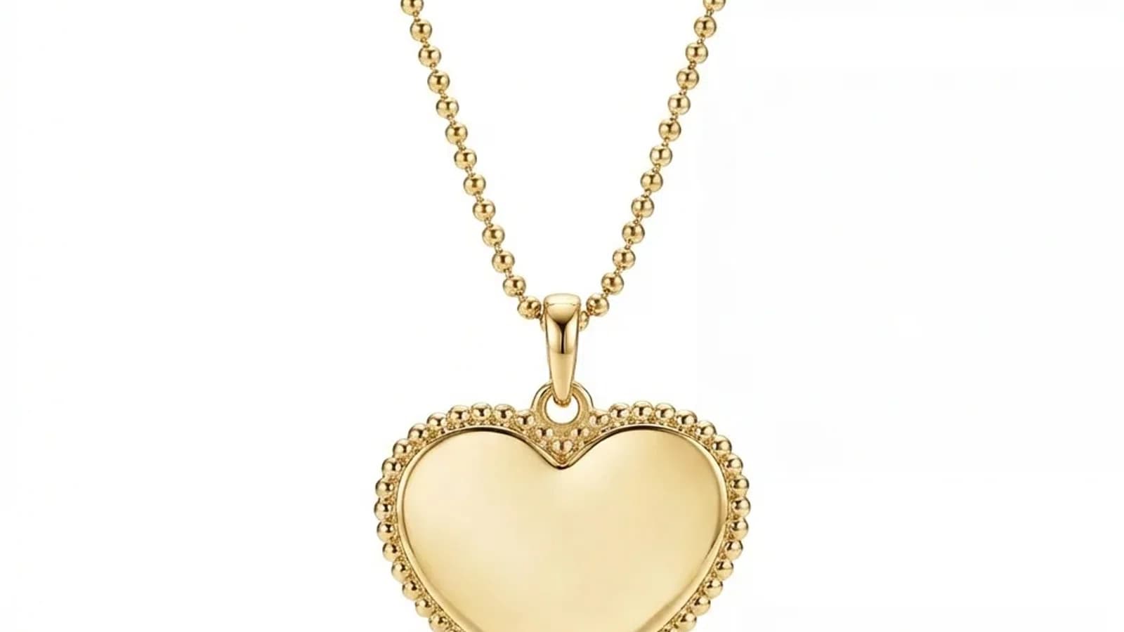
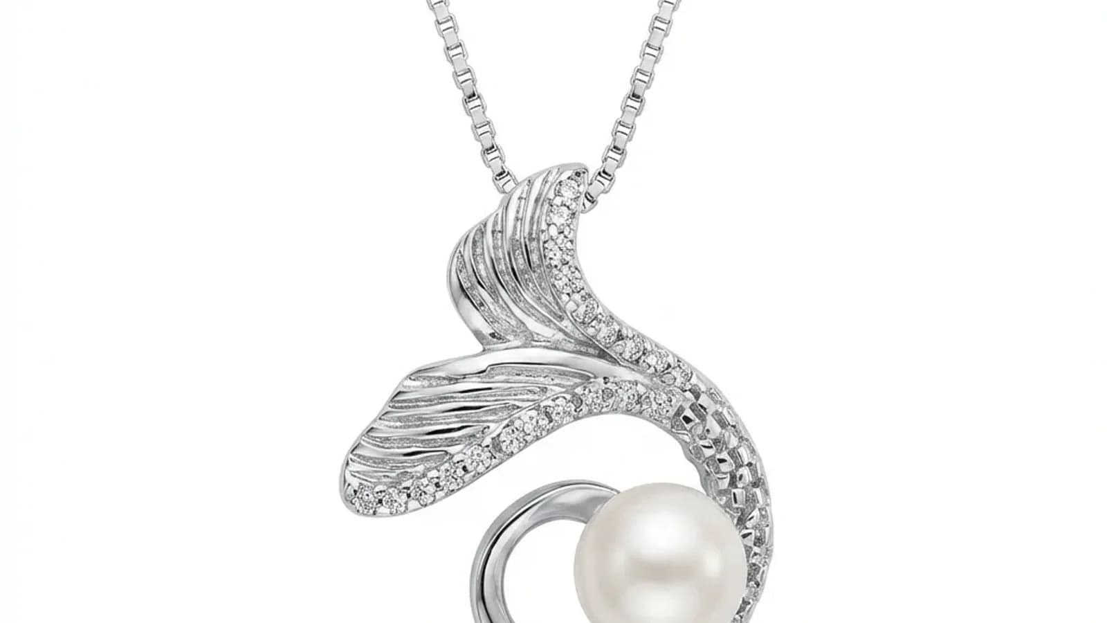
Put twelve of your product photos in one row. Do the rings sit at the same height? Do the shadows fall in the same direction? Does yellow gold stay the same yellow from SKU to SKU? If not, the problem is not one bad photo. It is a catalog consistency problem, and buyers feel it before they can explain it.
- 01Why consistency makes or breaks jewelry catalogsInconsistent product photos are one of the fastest ways to weaken a jewelry catalog. When backgrounds, lighting, and positioning vary between images, buyers perceive lower quality and lower trust. Consistent catalogs look more deliberate, easier to compare, and more professional.
- 02The psychology of visual consistency in online shoppingConsistency helps buyers compare instead of recalibrating every image. When crop, background, shadow, and metal color stay aligned, the product differences become easier to judge. When every SKU looks photographed under different rules, the catalog feels less controlled.
- 03What makes jewelry photos inconsistent?The five main causes of inconsistency are: varying backgrounds (different colors and textures), inconsistent lighting (changing conditions between shoots), non-standard positioning (different angles per piece), color shifts (white balance variations), and editor differences (multiple retouchers producing different results).
№ 01
Why consistency makes or breaks jewelry catalogs
A coordinated catalog makes products easier to compare when background family, framing, scale, light direction, shadow treatment, and color review follow a documented standard.
Inconsistency can make comparison harder: one ring may fill the frame while another is tiny, metal color may shift between sessions, and shadows or crops may change without a product reason. That does not prove anything about the seller or guarantee a commercial outcome, but it can obscure useful product information.
Define an approved sample for each necessary category, document the capture setup, process images sequentially, and review the complete catalog together. Measure buyer questions, engagement, conversion, and returns in your own business instead of assuming a fixed effect.
№ 02
The psychology of visual consistency in online shopping
Consistency is not abstract branding. It is a visual comparison tool.
A buyer comparing rings should be able to focus on the ring design, not wonder whether one gold tone is warmer because of the product or because the photo was shot under a kitchen bulb. A wholesale buyer scanning a line sheet should see one collection, not a set of images from five suppliers.
Run the catalog row test:
- backgrounds: same white, gray, or scene family
- crop: similar product scale by category
- angle: rings, earrings, bracelets, and pendants follow their own standard
- shadow: same direction, softness, and contact point
- metal tone: yellow gold, rose gold, silver, and platinum remain stable
- white balance: no blue cast on one SKU and warm cast on the next
If the row feels noisy, consistency is the issue. A style reference gives every new image a target instead of relying on memory or mood.
№ 03
What makes jewelry photos inconsistent?
Inconsistency creeps into jewelry catalogs from multiple sources:
1. Background variations:
- Different shooting locations or surfaces
- Inconsistent background removal (some with halos, some without)
- Varying background colors (pure white vs off-white vs gray)
2. Lighting changes:
- Natural light varies by time of day and weather
- Different studio setups for different shoots
- Mixed lighting temperatures (warm studio plus cool window)
3. Positioning differences:
- No standardized angle for each jewelry category
- Different photographers frame pieces differently
- Inconsistent use of props and supports
4. Color shifts:
- White balance changes between sessions
- Different camera settings or cameras
- Monitor calibration differences during editing
- Gold appearing orange in some photos and yellow in others
5. Post-processing variations:
- Different editors applying different correction levels
- Inconsistent shadow creation or removal
- Varying levels of metal polishing and gemstone enhancement
- No documented processing standards
Even studios with strict standards see drift over time. An editor who processes 50 images on Monday may produce subtly different results on Friday.
№ 04
Manual approaches to achieving consistency
Manual catalog consistency usually comes from documented capture positions, stable lighting and camera settings, controlled white balance, repeatable crops, approved editing guidance, and regular side-by-side review.
A reference-guided AI workflow can help coordinate presentation across separately submitted images, but it does not replace those controls or eliminate drift. Different source angles, lighting, materials, product geometry, and model output can change the result.
Choose the level of control that fits the catalog. Controlled capture and human retouching remain valuable for color-critical, high-value, historical, or complex assets; sequential AI jobs may be useful for suitable routine sources when every output is reviewed.
№ 05
How style references solve the consistency problem
The style reference approach changes how consistency is achieved:
How it works: 1. Select one professionally finished product image as your reference 2. This reference defines: background color, lighting direction, shadow style, reflection behavior, overall mood 3. Upload a new jewelry photo 4. AI processes the new photo toward your reference standard 5. Output follows the same background, lighting, and shadow direction
What the reference controls:
- Background: Same color, gradient, and edge treatment family
- Lighting: Direction, intensity, and color temperature matched to the reference
- Shadows: Similar direction, softness, opacity, and spread
- Metal rendering: Consistent reflection and polish level
- Overall color grading: Unified look and feel
Why this approach is stronger than manual standardization for everyday catalog work:
- Input quality matters less when the source is still sharp and well lit
- The reference becomes the documentation
- New editors do not need to interpret a long style guide
- The catalog standard remains stable over time
- Works across large volumes without asking a human editor to recreate the same look from memory
The style reference approach means a jewelry seller photographing products at a kitchen table with a smartphone can achieve a much more professional catalog rhythm.
№ 06
Common consistency mistakes and how to avoid them
Even with good tools, consistency fails when these mistakes are made:
1. No defined standard:
- Mistake: Telling editors to just make it look professional
- Fix: Choose one specific reference image and keep it stable
2. Changing references mid-catalog:
- Mistake: Using different reference styles as you process
- Fix: Commit to one reference per category and stick with it
3. Inconsistent cropping:
- Mistake: Different aspect ratios and framing for similar pieces
- Fix: Standardize output dimensions per category
4. Processing in isolation:
- Mistake: Reviewing each image individually
- Fix: Always compare new images against existing catalog grid view
5. Mixing processing methods:
- Mistake: Some images manually edited, some AI processed
- Fix: Use one processing method for your entire catalog
6. Ignoring category differences:
- Mistake: Using the same reference for rings and necklaces
- Fix: Create category-specific references
7. Spreading category work across weeks:
- Mistake: Processing similar products sporadically with shifting judgment
- Fix: Work through each category in one planned session with the same reference and review rhythm
The simplest rule: if two images from the same category look like they came from different catalogs, your consistency needs work.
№ 07
Building a consistent jewelry catalog: step-by-step
Here's a practical roadmap to transform an inconsistent catalog into a professional one:
Step 1: Audit your current catalog
- View all products in a grid layout
- Note inconsistencies: backgrounds, lighting, sizing, color
- Rate each category's consistency from 1-10
Step 2: Define your standard
- Select your single best product image (or have one professionally shot)
- This becomes your primary style reference
- Consider separate references per category if needed
Step 3: Process your existing catalog
- Start with your most visible products (bestsellers, featured items)
- Work through each category with the same reference
- Compare results side-by-side in a grid view
Step 4: Update your storefront
- Replace old images with consistent new ones
- Update all platforms simultaneously (website, Etsy, Amazon, etc.)
Step 5: Establish ongoing workflow
- Photograph new products as usual
- Process through AI retouching with your established reference
- Review against existing catalog for consistency
- Publish only after confirming the new image fits the catalog
The investment can be planned around credit packs instead of a custom studio quote. The return is a professional, consistent catalog that builds trust and differentiates your brand from competitors with amateur-looking listings.